
We cannot stress it enough: Responsive websites are key to the success of any business.
The online environment is evolving fast, so it’s absolutely vital business owners stay on trend to stay relevant.
According to Ofcom’s latest report, smartphones are now the preferred devices for connecting online in the UK. Indeed, the report reveals that more than a third of all adults use their smartphone within five minutes of waking up!
This recent ‘toppling of the laptop’ has been described as a ‘landmark moment’ and one that no business owner should ignore.
Mobile devices beat desktops for usage

Stats don't lie, mobile-friendly websites rank higher in search engine results.
So if you own a business and you don’t yet have a responsive website design then business opportunities could literally be slipping through your fingers. And just in case you’re still not 100% clear on what a good mobile responsive design is, it’s basically a website design that provides an optimal viewing experience for users.
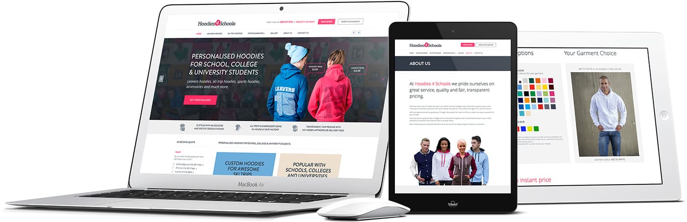
Responsive websites are wonderfully user-friendly and easy to read and navigate across a wide range of devices, from smartphones to smart TVs. This is because they are coded in a way that ensures minimum scrolling and resizing. They are proven to keep customers happy, engaged and buying, while non mobile responsive websites encourage customers to bounce away from the non-responsive website to find a user-friendly alternative.
So if you still don’t have a mobile responsive design, what’s the solution?
It’s simple. Talk to a web design company like Red-Fern Media that has proven expertise in delivering leading-edge responsive websites.

Consider the facts. Ofcom's latest report states:

And let’s not forget Google. Google actually rewards mobile responsive design when it comes to giving your website its rankings. Just like human beings, Google wants to navigate your site with ease and - with responsive website design - your website gets one URL as well as the same HTML across all devices. This makes it easier for your users and customers to share and engage with the content unlike websites that have different pages for mobile and desktop users and Google rewards this.

Non mobile responsive design, on the other hand, encourages your customers to bounce away and Google interprets this bounce rate, giving you a lower ranking on mobile searches.
Suffice to say this could have a serious impact on your bottom line, while positive customer experiences on mobile devices can directly translates into more profit as the customer is much more likely to purchase your product and service if it’s quick and easy to do so.
If you’re not providing a mobile-friendly experience for your customers, we can say quite confidently that your future may not be so bright. The future is most certainly mobile!
If you haven’t crossed over to a responsive website design, now’s the time to do it. If you’re a business owner based in Manchester, Blackburn or the surrounding area, then get in touch with one of our friendly team at Red Fern. We’ll be more than happy to talk you about getting you mobile responsive.
Welcome to the world of responsive websites! Your future is now looking brighter!
FREE 30 Minute Responsive Website Assessment Call
Find out why your business is not getting the results you expected
and how to increase the number of leads.
We will discuss:

Providing you with professional tips on how to improve your website today

Ways to create a unique and personalised user experience on your website

What your business goals are and if they're a good fit for a responsive website project

Pro tip: Once on a company's homepage, 52% of visitors want to see "about us" information. Make sure your website is mobile ready.