
Upgrading and adding value to your business’s website.
Stop sweeping it under the carpet. Ignoring issues with your website won’t make them disappear — upgrading means taking action.

Here are the main areas we think you should improve your website, which we’ll use as broader terms throughout this article:
What we will cover:
How to update a website.
Design.
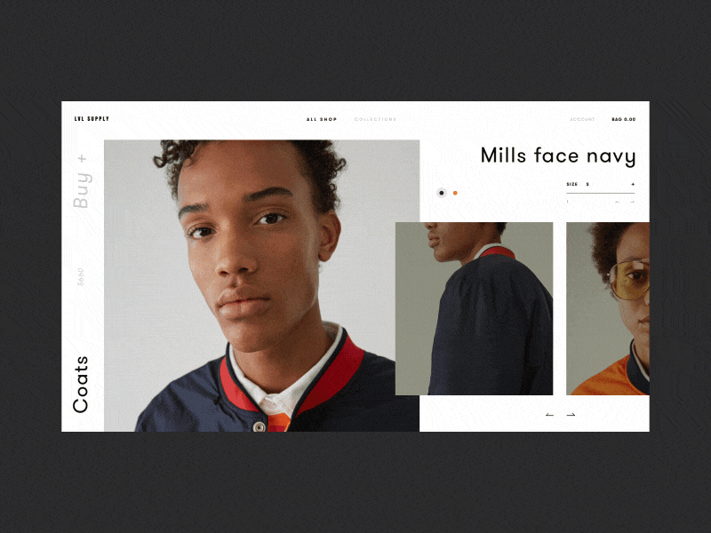
1. Branding.
Before you design anything, you need to transfer your brand to your website. Ensure you have a great logo design and consider using negative space and other design techniques, specific website goals and content direction. The three brands below dominate the sports world, and their logos are ingrained into our minds!
2. Visual appeal.
All websites need to be visually appealing; it doesn’t matter whether you’re showcasing work or have a blog as your homepage. If your site doesn’t look good, you’ll lose any credibility you had. And remember, different sites are appealing for different reasons; a retail website would have a different style to a manufacturing website.
3. Stop using stock photos!
Everyone knows a stock photo when they see one, right? Stocks make your website look overly manufactured and don’t show your true personality — what’s with all the ridiculously happy high-fiving corporate business people? Try to use rich, interesting images that capture the viewer’s attention.
4. Don’t be afraid of white space.
White space = breathing space. There’s nothing worse than looking at a page with too much on it. Ads, text, pictures, calls-to-action. Break them up and give people’s eyes a rest. Penguin’s books are known for their boldness and simplicity, which works well with the generous amount of whitespace on the page.
5. Use colour theory to your advantage.
If you know what colours invoke different emotions in people, you can use it to improve conversion rates on your website. Take a look at this graphic below, does the colour of your website resonate with what you’re trying to achieve?
6. Contrast and colour.

As well as knowing what colours invoke certain emotions, you can also use colour to make an image or part of your page stand out. For example, if you want someone to take the action of buying something on your page, you could make that button stand out by making it bright and bold. Lush have an advantage in that their products are bright and bold, so a simple white background makes them stand out.
7. Custom illustrations can reinforce your brand.
Custom illustrations can give your website a unique advantage. If a browser sees something extraordinary on your website, they’re more likely to give it more attention. Be subtle though, if you illustrate too much you could distract from the purpose of your web page. Intercom went for a semi-abstract style with bright and bold colours, which make their website unique.
8. Use motion and animation with intent.
Consider what message you want to send out with your animation, is it design driven or does it serve a purpose, like a percentage increase animation. See how this cryptocurrency mockup allows you to deliver a double message with the animation. It looks fantastic, but is it practical?
9. Icons.
Icons can be used to communicate ideas in a simple, straightforward manner. They should work simultaneously with the text supporting them to create visual intrigue. Sometimes an icon can be used to replace text; for example, a cog means ‘settings’. These icons from Musify look great, but do they tell us what they are?
User experience.
10. Provide easy navigation.
Easy navigation can have a positive impact on your web metrics. If it’s easier to navigate, you’ll decrease the number of people leaving your site because there’ll be clear directions for them to follow, plus, they’ll spend more time on the site and view more pages. This design by for stylist Julia Piep leaves little to the imagination.
We love this resource on some of the best online web design training course
11. Technique & coding.
Web designs aren’t only CSS and PhotoShop mockups. There’s a lot of work that goes on behind the scenes and having a designer that knows a thing or two about development is a bonus. They’ll be able to offer advice on what’s realistic, solve problems and communicate complex ideas and solutions. This portfolio/website CV is from developer and designer Robby Leonardi and shows what you can create with knowledge of both design and development.
12. Website speed.
Search engines will penalise slow websites, and they also make for a rubbish user experience. Nobody wants to go back to the days of the Microsoft sand timer, the quicker, the better.
13. Scrolling.
The jury has been out on scrolling for some time; some love it, some hate it. It’s about finding out what works best for your website. For example, if you have a lot of long blog posts with a massive scroll, you’ll want to optimise the speed of the page, so it loads quickly. But let’s make this clear, scrolling isn’t bad!
14. Responsive & mobile friendly.
If half of your website traffic is coming from mobile (you can check this in Google Analytics), do you think you should optimise it for mobile devices?
15. Forms.
Forms are what your website visitors use to fill in information, so they need to be effective. A poor form can be the difference between acquiring or losing a customer.
We’ve all been there, you fill out your details, and the page refreshes and deletes your data. So you give up. Give the best experience for the best return.
Compare the Market is a website that’s getting forms right; they’re easy on the eye, easy to fill in and quick to fill in!
16. Links.
Links are important because you can send browsers to an action-oriented page. Firstly, you need to ensure you highlight the right links. You wouldn’t want to send the user to a blog page from your homepage because there’s more chance of them leaving the website. Secondly, you need to make the link stand out. People scan pages so you wouldn’t want them to miss anything.
This homepage from eWedding links to various pages, and cleverly includes links to numerous templates.
17. Buttons.
A button is a simple, crucial part of your website that allows users to interact with your page. There’s always an action associated with a button, and it must be straightforward. However, that doesn’t mean you can’t be experimental and create unique designs.
18. Search bars.
Search bars. Google has made the search bar the most critical web design element for their business! We’re not saying you can emulate Google, but search bars are still important. Enhance the user experience by giving users the opportunity to search for something they want to see. It may be a product or a topic of interest, either way; it saves them trawling through your site and getting bored of looking.
19. Carousels.
Although there is evidence to suggest the first image on a carousel generates the best click-through-rate, it doesn’t necessarily mean they’re pointless. Carousels are useful for product slideshows, portfolios and photo galleries. They are pointless if you can’t think of a good reason why you have one though!
20. Accordions.
If you’ve got content-heavy pages and accordion is a design element that can make them appear slimmer by hiding some of the content. It has to be clear that it’s hidden, or the user will skim through it without recognising it. An accordion is like a combination of a content management tool and user experience tool.
ImpactBND is an inbound marketing agency that uses a blog as their homepage. To make sure users don’t get lost on their blog page, they have an accordion menu on the left on the screen to aid navigation.
Social media.
21. Let customers know what social media sites you’re on.
If a customer is interested in your company, they’ll want to know what sites your on. For example, if a large portion of your audience is on Instagram and you’ve only listed Facebook and X on your social media bar, you need to reconsider. This blended bar from Coca-Cola is bold and simple.
22. Utilise an Instagram gallery.
5 per cent of people on Instagram take action after being inspired by a post. An Instagram feed allows you to transfer user-generated content to your website, add vibrancy and promote brand engagement. It would help if you considered what industry you’re in and the strength of your brand. If you have twenty followers, you still need to work at your feed beforehand! Fashion boutique White Fox have an Instagram store on their website.
23. Allow social logins to make it easier to connect with you.
Make logging in/signing up easy for your users by implementing a social login system. Users won’t need to enter any details as you’ll be able to pull in their social data. It’ll be easier to communicate with them as social networks allow you access to their data, plus you’ll be able to avoid spammers because most social media sites authenticate their users.
24. Embed YouTube videos when appropriate.
You can use videos on your blog posts to give them another dimension. While pictures work fine, you can explain a lot more in a video, and they’re more interactive. You can show your product, your team, anything you deem relevant. Set up a channel to host all of your videos and build a presence.
Lead generation/CRO.
25. Effective use of calls-to-actions.
The whole point of a website is to get visitors to complete an action on it. This is where your CTA’s come in, and they need to be effective to work. They should be visually strong, persuasive, stand out, work with your website and ask for clear action.
26. Add forms to the pages that get the most traffic.
Sometimes a form can be your CTA. If you want someone to sign up for your service or you give something away for free, put it on the website page you think it will be most effective on. You don’t have to be a genius to work out that consumers fill in their contact details on the contacts page!
27. A/B testing.
Sometimes you end up with two designs. It happens. Can’t decide which one will generate the most leads? Then A/B test it and go with the one that performs the best. Aesthetics are a huge part of web design, but performance is where the best websites shine.
Crazy Egg conducted an A/B test for EA and their SimCity game. They found that the second page performed better because their audience didn’t need an incentive to buy the game. It was a distraction and prevented their loyal audience from getting what they wanted.
28. Start with a basic CTA on your homepage.
Keep it clean and clear on your homepage. If you confuse the visitor with too much information, they’ll probably leave. Ask yourself this question: “What do we want our visitor to do when they enter our homepage?”. And be realistic, ‘buy our product’ probably isn’t a viable option.
See how TUI have two clear call-to-actions on their website homepage, so you’re either going to either one or off the page. They aren’t leaving anything to chance!
Content.
29. What comes first? Content vs design.
You have to offer something extraordinary if you’re going to get away with bad design. For example, Craigslist or the older version of Reddit don’t offer cutting-edge web design, but the content on the website makes them popular. Likewise, if you’re website is going to house a lot of video content, you’d need to design your website with that in mind. Consider what you’re designing your site for and make a plan around it.
30. Use simple words.
Jargon and long words confuse everyone. As a web designer, you know what CMS is; but do your audience? Sure you know that certain areas of web design are superannuated, but does anyone know what that means? What are the words that describe this website? Keep your language simple, everyone can understand it then.
31. Answer questions.
What questions do your website visitors need answering? It would help if you referred to your buyer personas when writing content:
- What did they try before?
- Did it work?
- How did they end up on your site?
- Have they bought from you before?
- What are their goals?
- What are their challenges?
- How do they gain information?
If you know this information, writing content will be easier.
For example, this website copy for PacMoore would resonate with people in the food industry who care about the production process and the people involved in it. See how it matches with the images and videos to create a powerful message in just 12 words!
32. Get to the point!
Nobody wants to read through a load of waffle. It’s the curse of the copywriter that doesn’t know what they want to say. So they say everything, that way you’ll get some of it right. Wrong. Mean what you say and say what you mean! Keep your paragraphs short and sweet, especially on your homepage. If we asked you what Gaviscon was for, would you know by looking at their webpage?
SEO.
33. Check your data before designing.
Google will index sites that have a favourable user experience. It measures this in various ways: your bounce rate, time spent on pages, pages viewed per visit, social shares, and inbound links. Before you design your site, you should pay attention to all these metrics and let them shape your goals.
34. Create a crawlable website.
From a designers perspective, you need to create a site that people want to look at and navigate through. From an SEO perspective, you need to create a site that can be found in search engines. Ensure your inbound link structure is strong because this is the way search engines crawl your site.
35. Plan quality content.
Not only does quality content help your readers navigate your site, but it also helps search engines rank it. Readability, punctuation, grammar, keyword selection; it all counts. If you want search engines to rate your site, start taking content seriously.
36. Plan your changes.
If you already have a high ranking website, you wouldn’t want to damage your reputation by making rash decisions. Use SEO software like Ahrefs or SEMrush to determine how you can maintain your current rankings while redesigning your website.
37. Remember your meta descriptions.
You may be chuffed with your new website, but if you don’t fill in the meta descriptions on your web pages, you’re at risk of damaging your SEO profile. The best thing: they’re easy to input. The worst thing: it’ll take you a while if you’ve never done it before!